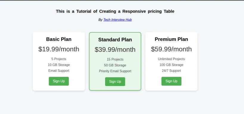
In web development, creating clean, responsive, and user-friendly UI components is crucial. One such component that many web developers often build is a Responsive Pricing Table. Pricing tables are essential in showcasing different service plans or product pricing. In this blog, we’ll break down how to create a simple, yet elegant pricing table using HTML and CSS, step-by-step. Not only will you understand the core concepts, but you’ll also have something tangible to showcase in interviews.
- How to structure a basic HTML layout for a pricing table.
- Step-by-step guide to styling the table using CSS.
- Responsive design techniques to make the table look great on all devices.
- Why these design choices are important, both for user experience and for showing your HTML & CSS skills in interviews.
In this tutorial, we will build a fully responsive pricing table step-by-step. You can follow along using the live CodeSandbox demo below:
Live Demo on CodeSandbox:
Desktop and Mobile view
Basic HTML Structure of the Pricing Table
The first step in building a pricing table is to define its structure in HTML. This step will focus on how to organize the content for the table, ensuring it’s semantically correct and easy to style with CSS later on.
Here’s the basic HTML structure for a simple pricing table:
<!DOCTYPE html>
<html lang="en">
  <head>
    <meta charset="UTF-8" />
    <meta name="viewport" content="width=device-width, initial-scale=1.0" />
    <meta http-equiv="X-UA-Compatible" content="ie=edge" />
    <title>pricing Table</title>
    <link rel="stylesheet" href="styles.css" />
  </head>
  <body>
    <div class="hero-header">
      <h2>This is a Tutorial of Creating a Responsive pricing Table</h2>
      <p>
        <i>By <a href="https://techinterviewhub.in/">Tech Interview Hub</a></i>
      </p>
    </div>

    <div class="pricing-container">
      <div class="pricing-card">
        <h3 class="pricing-title">Basic Plan</h3>
        <p class="price">$19.99/month</p>
        <ul class="features">
          <li>5 Projects</li>
          <li>10 GB Storage</li>
          <li>Email Support</li>
        </ul>
        <button class="btn">Sign Up</button>
      </div>
      <div class="pricing-card featured">
        <h3 class="pricing-title">Standard Plan</h3>
        <p class="price">$39.99/month</p>
        <ul class="features">
          <li>15 Projects</li>
          <li>50 GB Storage</li>
          <li>Priority Email Support</li>
        </ul>
        <button class="btn">Sign Up</button>
      </div>

      <div class="pricing-card">
        <h3 class="pricing-title">Premium Plan</h3>
        <p class="price">$59.99/month</p>
        <ul class="features">
          <li>Unlimited Projects</li>
          <li>100 GB Storage</li>
          <li>24/7 Support</li>
        </ul>
        <button class="btn">Sign Up</button>
      </div>
    </div>
  </body>
</html>
- The HTML structure should be semantic and easy to understand. Using
<div>tags for containers,<ul>for lists, and<h3>for titles ensures that your content is well-organized and readable. - This basic layout provides a strong foundation for styling with CSS later on.
- pricing-container, pricing-card, featured, pricing-title, price , and btn are classnames . we have used those classnames to group style.
Styling with CSS – Step-by-Step Guide
Once the HTML structure is in place, it’s time to style the table using CSS. The CSS will make the pricing table look visually appealing and responsive across devices.
Here’s the accompanying CSS:
/* Reset some default styles */
* {
  margin: 0;
  padding: 0;
  box-sizing: border-box;
}

/* Body Styling */
body {
  font-family: Arial, sans-serif;
  background-color: #f4f7fa;
  padding: 20px;
}
/* hero header Text styling */
.hero-header {
  display: flex;
  flex-direction: column;
  align-items: center;
  justify-content: center;
}

.hero-header h2 {
  font-size: 20px;
  word-spacing: 4px;
  letter-spacing: 1;
  margin: 20px;
}

/* Pricing Container Styling */
.pricing-container {
  display: flex;
  justify-content: center;
  gap: 20px;
  margin-top: 50px;
  flex-wrap: wrap;
}

/* Pricing Card Styling */
.pricing-card {
  background-color: #fff;
  border-radius: 10px;
  box-shadow: 0 4px 8px rgba(0, 0, 0, 0.1);
  padding: 20px;
  text-align: center;
  width: 250px;
  transition: transform 0.3s ease-in-out;
}

.pricing-card:hover {
  transform: translateY(-10px);
}

/* Featured Plan Styling */
.pricing-card.featured {
  border: 2px solid #4caf50;
  background-color: #e8f5e9;
}

/* Pricing Title */
.pricing-title {
  font-size: 1.5em;
  font-weight: bold;
  margin-bottom: 15px;
}

/* Price Styling */
.price {
  font-size: 2em;
  color: #333;
  margin-bottom: 20px;
}

/* Features List Styling */
.features {
  list-style-type: none;
  margin-bottom: 20px;
}

.features li {
  margin-bottom: 10px;
  font-size: 1em;
  color: #555;
}

/* Button Styling */
.btn {
  background-color: #4caf50;
  color: #fff;
  padding: 12px 20px;
  border: none;
  border-radius: 5px;
  cursor: pointer;
  font-size: 1em;
  transition: background-color 0.3s;
}

.btn:hover {
  background-color: #45a049;
}

/* Responsive Design */
@media (max-width: 768px) {
  .pricing-container {
    flex-direction: column;
    align-items: center;
  }
}
Why this is important?
- Flexbox is used to align the cards, ensuring that they are responsive and neatly stacked on smaller screens.
- Hover effects make the cards more interactive.
- The featured plan (the second card) is visually highlighted by adding a green border and a distinct background.
- The media query ensures that the layout adapts to mobile screens, making it fully responsive.
Output:-
Conclusion:-
Building a responsive pricing table is a great way to strengthen your core HTML and CSS skills, and it’s a common interview task because it helps employers quickly see how well you understand layout, structure, and responsive design. This small project shows your ability to write clean code and build real UI components. To prepare even better for interviews, explore more of our blogs on HTML & CSS topics and interview questions.


![Top CSS Interview Questions and Answers [Latest & Most Asked]](https://mlegnhsg05mg.i.optimole.com/cb:ir3L.9a8/w:1024/h:684/q:mauto/f:best/https://techinterviewhub.in/wp-content/uploads/2025/02/pexels-kampus-8439764-scaled.jpg)